Customization
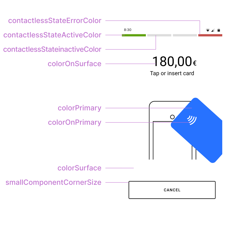
The Default UI can be customized to match the visual identity of your brand. The UI display examples shown below include the style elements that can be customized. The table that follows the examples describes these style elements.
UI Style Element | Description |
|---|---|
contactlessStateErrorColor | Error indicator color that displays when a problem occurs with the device attempting to read a card on the contactless interface. |
contactlessStateActiveColor | Active indicator color that displays when the contactless interface is ready or when a payment card is tapped on the device. |
contactlessStateInactiveColor | Inactive indicator color that displays when the contactless interface is not active. |
colorOnSurface | Color for text that displays over the content view, transaction status badges text, and outlined button stroke. |
colorPrimary | Primary color that displays for the filled buttons and animations. |
colorOnPrimary | Primary color that displays for the filled button text and animation details. |
colorSurface | Background color that displays for the content view. |
smallComponentCornerSize | Defines the corner radius of the buttons and transaction status badge. For example, set this element to 0dp for square corners, 4dp (default) for slightly square corners, or 32dp for round corners. |
approvedStateColor | Indicator color that displays for the approved transaction badge and animation. (Not shown in the UI display example above.) |
declinedErrorStateColor | Indicator color that displays for:
(Not shown in the UI display example above.) |
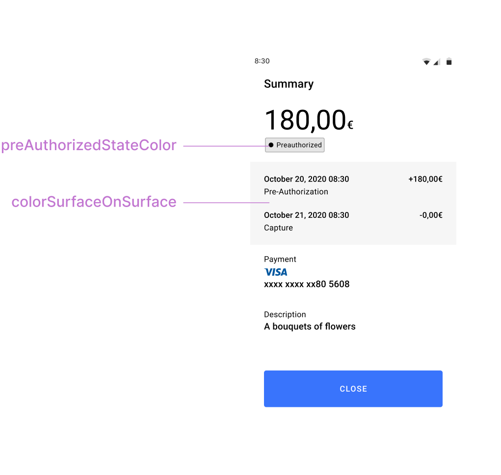
preAuthorizedStateColor | Indicator color that displays for the pre-authorized transaction badge. (Not shown in the UI display example above.) |
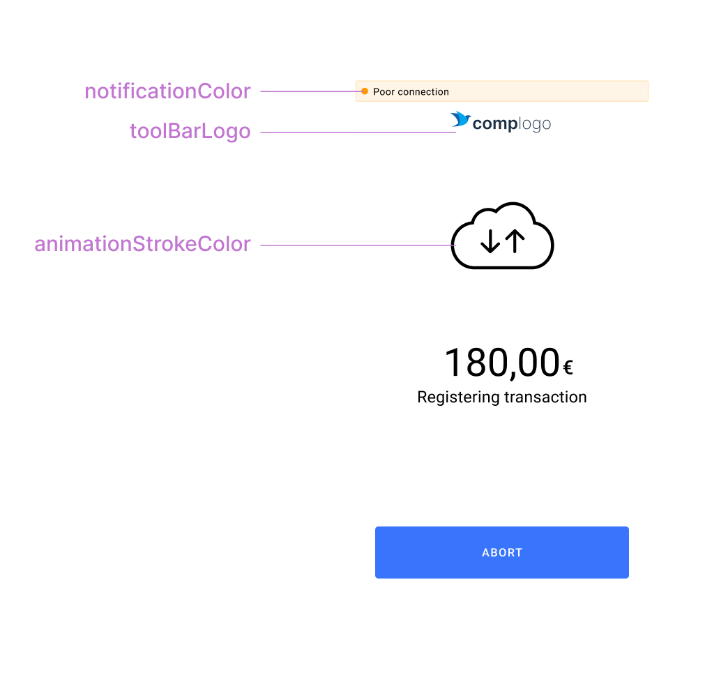
notificationColor | Alert notification color that displays with "Poor connection" and "Low battery" notifications. Default color is yellow. |
toolBarLogo | A drawable (such as a PNG image) used for the merchant's company logo that displays during payment option selection and transaction status updates. |
animationStrokeColor | Stroke or outline color for animations. |
cardPresentAnimationStrokeColor | Overrides animationStrokeColor (shown in UI display example above) in the card reader drawing on present-card animations. By default, the same as animationStrokeColor . |
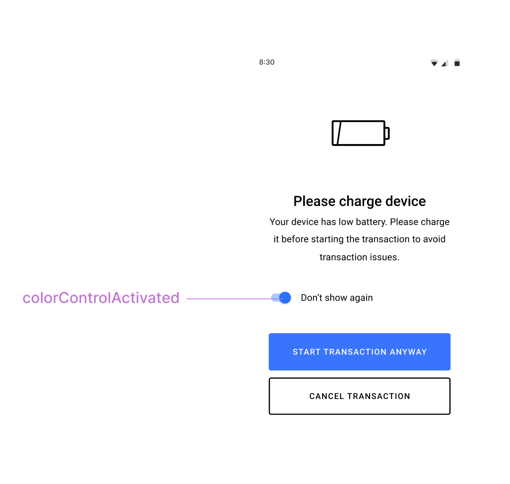
colorControlActivated | Color applied to switch controls in their active state. |
colorSurfaceOnSurface | Background color for displayed lists such as transaction history. |
Changing the Default UI Style
To change the default UI style, introduce a new theme to your application that includes the
Theme.PayButton2
as a parent theme. For example:<!-- Paybutton theme --> <style name="Theme.AppTheme.SampleTheme" parent="Theme.PayButton2"> <!-- Text color --> <item name="colorOnSurface">@color/black</item> <!-- Background color --> <item name="colorSurface">@color/white</item> <!-- Contactless indicators --> <item name="contactlessStateActiveColor">@color/dui_green</item> <item name="contactlessStateInactiveColor">@color/dui_light_gray2</item> <item name="contactlessStateErrorColor">@color/dui_red</item> <!-- Transaction status --> <item name="approvedStateColor">@color/dui_green</item> <item name="declinedErrorStateColor">@color/dui_red</item> <!-- Also used for error messages and dialogs --> <item name="preAuthorizedStateColor">@color/dui_dark_gray</item> <!-- Filled buttons and animations primary color --> <item name="colorPrimary">@color/dui_blue</item> <!-- Used over the primary color for text on filled buttons and details on animations --> <item name="colorOnPrimary">@color/dui_white</item> <!-- Corner radius for the buttons and transaction status badges --> <item name="smallComponentCornerSize">4dp</item> <!-- Company logo --> <item name="toolBarLogo">@drawable/logo_140x36</item> <!-- Stroke color for icons and animations --> <item name="animationStrokeColor">@color/dui_black</item> <!-- Stroke color for terminal in present card animation. By default the same as animationStrokeColor --> <item name="cardPresentAnimationStrokeColor">@color/dui_black</item> </style>
Next, call one of these methods to set the theme:
Kotlin
mposUi.themeRes = R.style.Theme_AppTheme_SampleTheme
Java
mposUi.setThemeRes(R.style.Theme_AppTheme_SampleTheme);
Dark Mode
Dark Mode is a customization feature that can be enabled to display the Default UI payment flow screens in darker contrasting colors than are displayed when using the default settings. This feature might be used in low-light environments such as restaurants and bars.
To change Dark Mode behavior, use the
UiConfiguration
parameters DISABLED
, ENABLED
, and SYSTEM_DEFAULT
, as shown below.Kotlin
val configuration = UiConfiguration(
    nightMode = UiConfiguration.NightMode.ENABLED
)
mposUi.configuration = configuration
Java
UiConfiguration configuration = new UiConfiguration.Builder()
        .nightMode(UiConfiguration.NightMode.ENABLED)
        .build();
mposUi.setConfiguration(configuration);
Dark Mode Implementation Considerations
- The default primary color in Dark Mode is dark gray (#121212). You can change the default color to any color that fits your corporate design.
- When the Default UI is in Dark Mode, the darkest background color can be configured to switch pixels off, if this adjustment is enabled on the device.
- When creating a new dark theme in the value-night folder, remember to extend our theme, "Theme.PayButton2", to customize the Default UI colors.
Related Links